
It is now June, and we are so, so close to the finish line to launch our game.
We have been through so much already during the development process. A lot of unexpected roadblocks, underestimated timelines to finish certain features, etc. The initial idea was to complete everything by April and spare 2 months just to handle the App/Play Stores but… that’s not the case right now isn’t it?
To be fair, in game development you have to expect the unexpected a lot more than usual – it’s a volatile industry after all. It was perhaps the right choice for me to initially target the release by Q2 2023 but we still ended up delaying the game. It may be for only a month but a delay is a delay regardless. My apologies for this…
Anyways, here’s a progress update of what we have done so far.
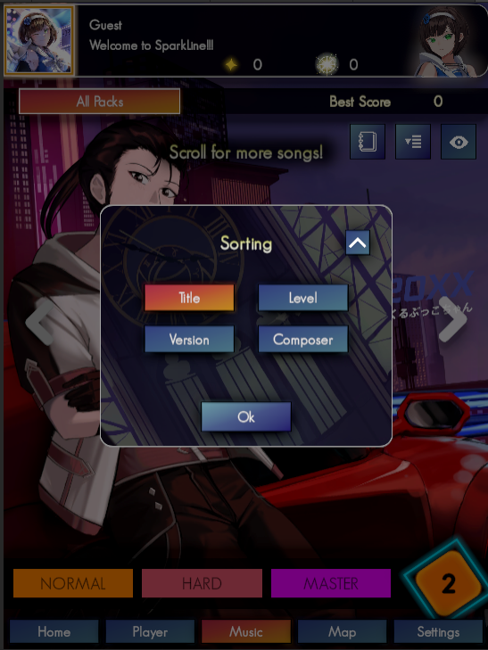
A lot of you remarked that the current tutorial (if you do see it) is not very helpful.
I agree with that.
So we checked for our competitors and along with some unrelated games, we decided our tutorial must be:
In addition to this, it must NOT be a dedicated tutorial level as this is actually a lot of work to implement. You will need:
With the remaining time we have, it is not worth it to do that. All in all, I feel the latest way we are doing should be the best compromise. I do believe that in the future, mobile rhythm games will scrap the “tutorial level” methodology as these are usually a bit long for the players.
On another note, other tutorials are also being prepared in particular for the Map system.
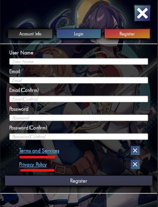
We need this to comply with legal requirements. The TOS and PP are two webpages already available in this website and are quite easy to implement, but the delete account feature is quite tricky.
I had to engage in server-side scripting and that’s essentially unfamiliar territory for me.
With such a feature in use, we also have to check edge cases where your account is on 2+ devices, especially when cloud save is added to the equation.
What started out as a mandatory legal requirement ended up being work to prepare for Cloud Save as well. Speaking of that, I am not sure if we can cram it in for launch, so please be careful if you like to use your account in 2+ devices!
On an extra, but important note, you no longer have to start with a registered account to play in the full version. Hence, the “Register” function is actually more akin to a “Link Account” feature now.
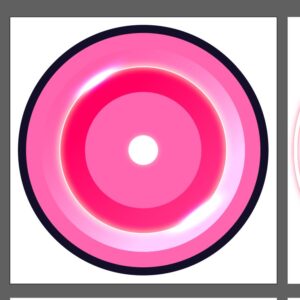
Much like the tutorials, the latest note designs (especially its colors) can still use some more work. Maymiyuriae is back just in time (she was busy with her studies) to refine the note designs further.
In regards to the shapes, I think most are fine by now, except for the slides. I do want to make the slides’ color the same as the basic notes so that it’s less work for the graphic designer to think of the colors overall. That also means that shape-wise, it needs to be even more distinct than the current one.
This is still a work in progress and unfortunately, we are unable to push it out for this beta test. It’s also something you need to iterate and test a lot to get the best results.
Our feedback form for the 2nd and final beta test is ready. This is where you can provide feedback in a detailed and private manner so be sure to fill it up with your honest opinions!
https://docs.google.com/forms/d/1rudV69FNsYaTjP36OOwaFHUC0J2lYTSGytNwYl3UNzs/edit
Also a little tidbit from me – it’s really nice that most of you that do say something in our Discord say that it’s a good game, charts are fun. It bodes well for us but of course, small sample size alert. We are admittedly quite falling behind on the marketing side because… there are so many things we need to handle first. However, it should be easier for me to market a good game rather than a bad one.
On the worst case scenario we have too many “bad game” feedback then we definitely have to delay the game, or even outright cancel it but that’s why we had an earlier beta test last December. Gamescom Asia too was helpful in gauging the reactions of players that were unfamiliar with otoges… Which is what most of the game’s players should be.
After RekuMochi’s interview in March we didn’t have any more at the moment. I was very busy and the conversational format I am doing them with means it won’t be completed quickly with one composer at a time.
I am thinking of doing 2-3 interviews at once so that we have some stock in reserve, in case we don’t have the time (like right now).
You will be able to access the interviews from the game as these are thing we’d like you to know. Probably from the home screen.
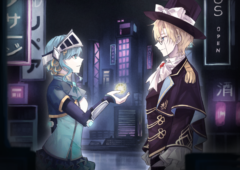
You have seen the above artwork before, but there’s something… slightly different now.
In terms of content we still have quite some work to do:
Technically, we have these remaining:
The next two weeks promise to be very busy for us! I will be staying away from social media quite a bit (which is perhaps better overall) so it may take some time for me to respond to your messages.
Also a little bit of admission from me – I feel burnt out by social media lately. I probably shouldn’t check my Twitter FYPs so often. Once our game gets a full release we’d definitely be looking for a CM (Community Manager) so that I can be more focused on work.
I will still make blogs and composer interviews, though!