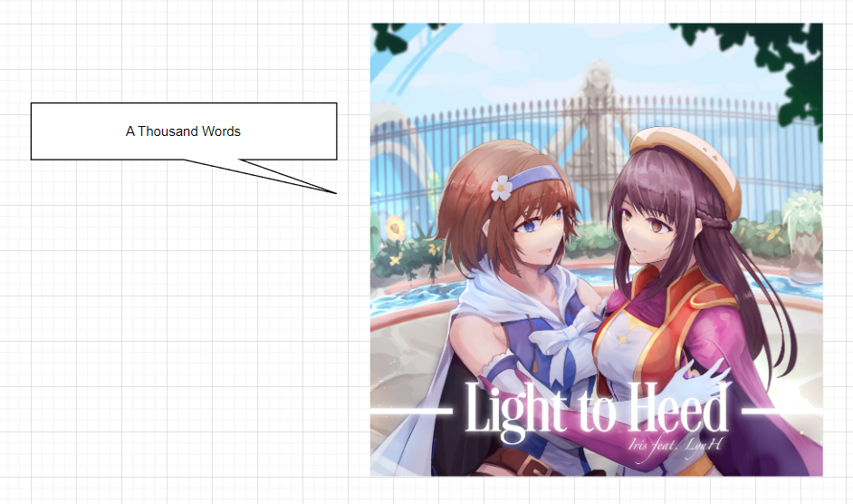
A Picture Tells a Thousand Words
It’s been two weeks since the last blog post of how we do commissions for composers. Time to continue the series of posts to the artwork side of things. First of all allow me to say thank you so much for your interest in the last post. I am glad if you felt it was interesting and helpful for you.
Before we proceed, although the word “artist” can be a little vague, let’s refer to them as the drawing kind of artist (aka illustrator).
First things first – where and how to find them? We use Twitter and Facebook. Pretty simple right?
There are so much more artists than composers around (higher supply, higher demand), but that actually makes it more difficult to get the right ones for the job. It’s like waiting for a bus – sometimes we can look for a whole month and find nothing, and then all of a sudden we find 2-3 people we can work with immediately. Life is like that sometimes.
I admit it’s quite an undertaking to create a song artwork. Drawing the character is something most of you can do, but to make backgrounds and typography too is extra work. In addition to this, I will request layered .psd files for animation purposes. I will guide you on the typography and layering as much as I can but the rest mostly depends on you.
In contrast to composers where I want a lot of them for variety’s sake, I’d want to have a few “core” artists for consistency. Given that you’d be familiar with my requests and you’re nice to work with, then why not?
Venting Frustrations
Before we proceed further, let’s get the not-so-good parts out of the way first.
Allow me to a bit frank with my experiences working with artists – it’s not always rosy. Without saying too much (I’d be in trouble if I do so), I feel that while Indonesian artists (we only commission Indonesians for art so far) can potentially be as good as any, most of them lack the application to reach the top. To say it nicely, there is a process to get there that you have to understand and respect. And let’s say you manage to get there, you have to do even more to maintain the levels.
A lot of people want to “get famous”, while I understand the sentiment I disagree with it. Simply put, I believe it’s part of a process, or even a residual effect of reaching your goals rather than THE end goal. And if you simply want to get “famous”, you can always just insult the president’s wife (Indonesian news link) or something.
Although I don’t claim to know best, I will try my best to help those working with me to be in the path I feel is right for them. But if I see there’s no point in it then it’s best we part ways and move on from each other. To even say this… is difficult, and most definitely frustrating for me. When people are capable of so much more and they are not realizing it, it’s sad to see.
Enough of this discourse, and let’s talk about the artworks.
Let's Work Together!
In the previous blog post I did remark about needing the song to be completed first before we proceed anywhere else, including for this (the artwork). That is the case for original songs. The non-original ones… well, they are immediately complete aside from a little cut if needed, no?
What usually happens is I see an artist opening commissions either on Twitter or Facebook, I contact them whether they are open or not (just to make sure, in case their slots are taken so quickly), and inquire about their prices.
With artworks these are taken into account when deciding the price:
- The character’s proportion (usually counted by bust-up, half-body, or full body)
- Addition of characters of course increases the cost of the artwork
- Addition of background
- Sometimes layering (or more generally the request of psd files) adds up to the cost
If you are not animating your songs (at least as much as mobile devices allow), you can probably skip the .psd request but I do recommend you to get it as well if you are commissioning artists.
As for the backgrounds, we don’t need overly complex ones as it can instead clash with the typography (song title and composer) but at the same time obviously we won’t like simple, flat-color backgrounds too. Backgrounds for bust-up artworks are generally simpler since the character will take up most of the space.
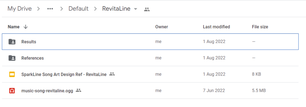
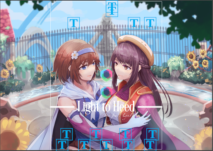
This, for example, is the folder for RevitaLine in which the artwork is done by Yua. The google slide will contain instructions on how I envisage the artwork to be like. The artist is able to edit the contents of the “Results” folder where they upload the… results of the commission to.
They will see the instructions and then decide how much to charge for the artwork based on the proportions asked etc. I usually pay after the sketch is finished but if we are already familiar with each other, I can make some compromises 🙂
Once everything is agreed upon, we’ll have the licensing agreement which is sometimes commercial, sometimes exclusive. For the former, I am generally not allowed to sell it as a physical merchandise. At the moment we don’t have any plans for that (let’s just stay alive first) so… at any point, if I want to we can discuss things again with the assorted artist.
The Creation Process
After the agreement, I will ask for updates on these parts of the creation process:
- Sketch: Where we decide the pose, the general look of the background.
- Base color: The simpler colors of the artwork, at this point the depth perception etc is more visible too. Sometimes, people do both
- Rendering: Polishing and stuff. It is hard to make changes at this stage of the artwork so you should ask for revisions in the previous two phases to make it easier for both sides.
- Layering: After rendering, PSD file is sent to me and I will check whether it’s sufficient for animation purposes. If I feel there are things that can be layered separately, I will ask you to do so.
A little note on the layering – so far most of the commissioned artists use either Clip Studio Paint or Medibang. Both of these tools handle layering differently so usually they will have to adapt in order to make the .PSD file as similar as possible to the original artwork.
Last but not least before we move on to another part, we need to get the characters done before we make the artworks. It’s a different part of the process so I probably shouldn’t elaborate it on this post.
Next, we’ll talk about Oriental Groove in which the artwork was done by JustRFL and how it connects to the game’s story.
Oriental Groove's Artwork and how it Connects to the Story
Honestly, there are a lot of songs in which we can talk of the artwork about. But for this blog it’s probably enough to just highlight one song.
When I listened to this song, I thought of a club/lounge setting. I happen to play the Yakuza series and watched the recent Zhuge Liang anime and I thought “Let’s make Maharajah in SparkLine” and that was it. Certainly, it helps that such settings would tie to SparkLine as a rhythm game, despite the online VR game story.
Remember this caption we wrote for the gameplay video on Twitter? Everybody has their own reasons to play games. From pure competitive streak, catching up with old friends or maybe you just like certain minigames inside it! There are many characters and personalities inside the World of Spark, and no matter the motivation, they are welcome to play the game… As long as you don’t cause a nuisance to yourself and others.
It’s the same point I’d like to drive for SparkLine.
Maybe you like the game for its artworks, its songs, its story, or maybe you want to All Perfect everything. Perhaps your motivation for playing may even be a mix of everything! For me, as long as you enjoy it and you feel it’s fun, that’s what matters most. And… your financial support too, I suppose.
The lounge setting ended up being used for more than just these songs. In time, you will hear about it.
By the way, do you know that the stories of Oriental Groove, Spy-DR and Horizon Ramblue are connected? Let’s compare the artworks side-by-side.
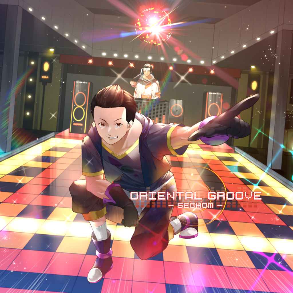
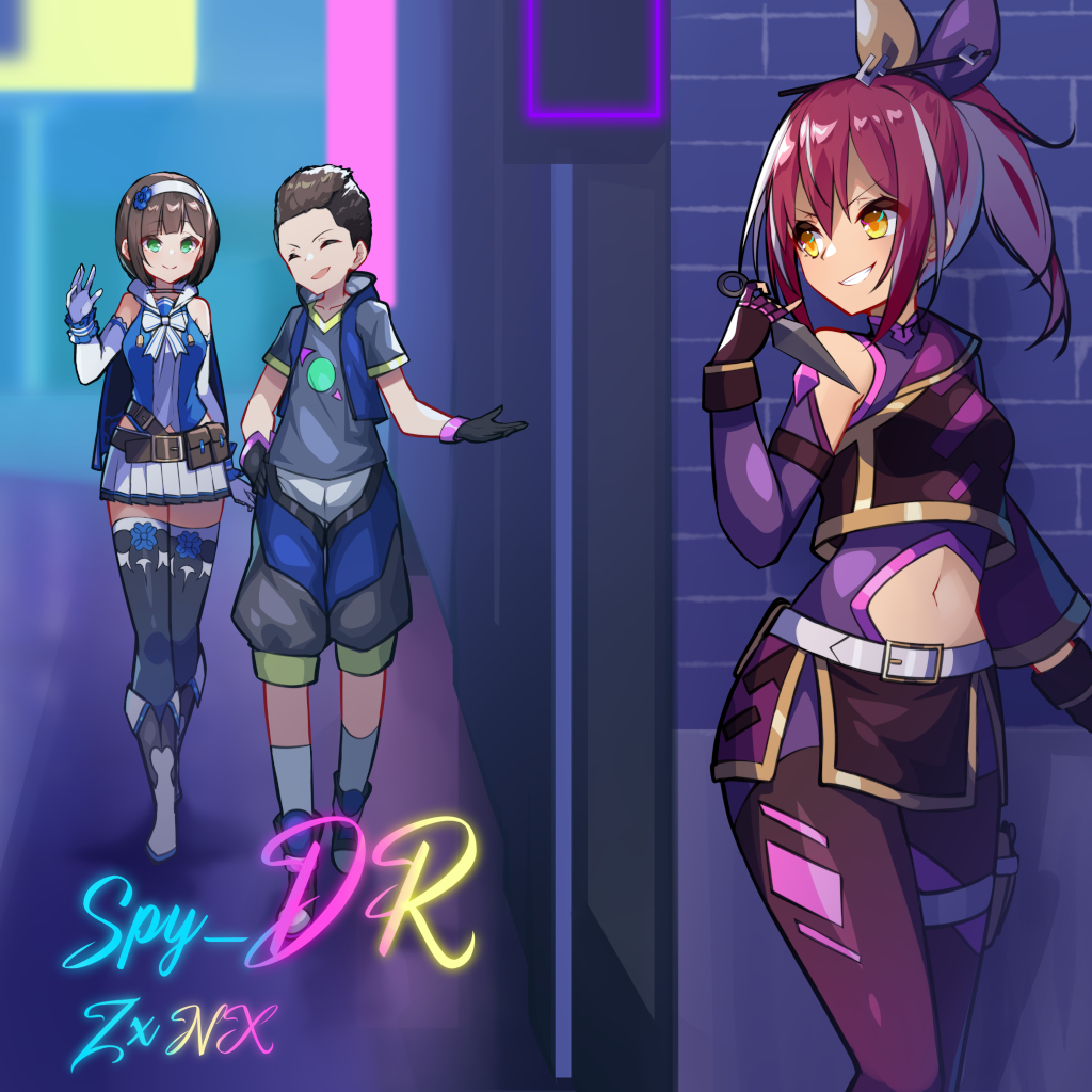
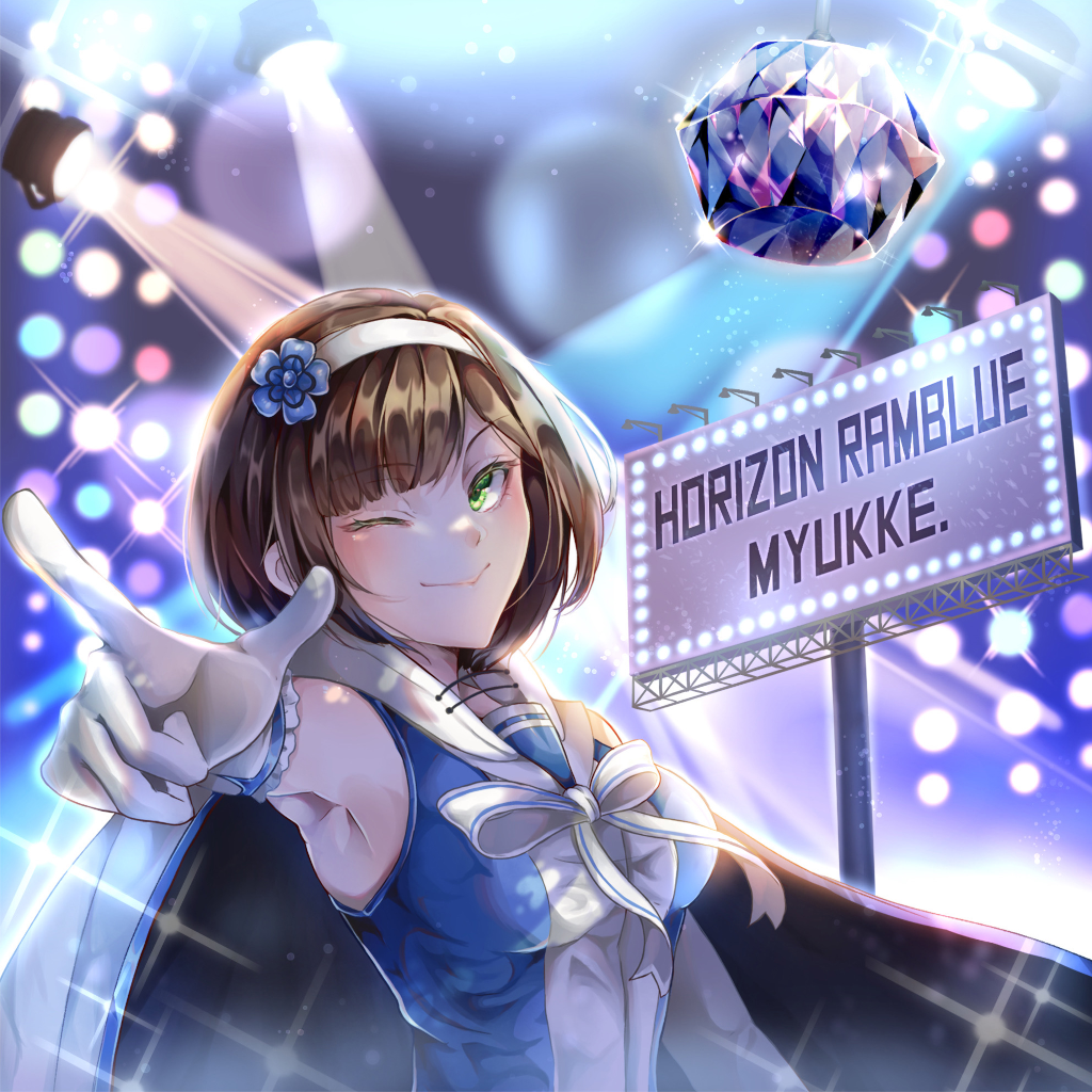
You can probably see how Oriental Groove and Horizon Ramblue are connected but it’s a stretch to connect it with Spy-DR. That’s where our story scripts and cutscenes come into play.
Oriental Groove was finished a lot later than Ramblue. The former was in August (IIRC) while the latter was in April. When I commissioned Sechom I wasn’t specifically asking him to make a song that ties to Ramblue or anything. Meanwhile, Ramblue’s artwork was made when the art direction was a bit haphazard, to say the least. As time passes we learn new things, and eventually things become standardized.
Let me tell you more about it.
Standardizing the Art Direction
How’s the World of Spark going to look like? To be honest… I have no idea at the beginning except for yeah, like an “anything goes” kind of world. You can have a traditional medieval town, and later you go to a midnight city with skyscrapers, and so on. Also thought of it like that so that you can get adventurer and tacticool looks in the same game.
But moreover, I wanted a modern setting as there are things I like to express and convey to the modern world. So an online game setting probably works best all in all.
A lot of the earlier artworks didn’t have worldbuilding in mind. Ramblue’s artwork is a little vague in this regard – where is this supposed to be? You can see there’s a concert hall setting or some sort, but how does it connect to the rest of the world?
These settings weren’t really in my mind back then (my bad). As the story slowly but surely takes shape, we improvise so that we can also give story relevance to the older artworks. To be fair, you’ll be “winging it” a LOT in game development. This is one form of it.
Artwork Aspect Ratios
Anyways, there’s another part of the art standardizing that is equally as important – the aspect ratio of the artworks.
When I started making this game, I didn’t know about the actual sizes of A4 and A3 papers. And despite to animate the artworks with the psd layering, I didn’t even know what a blend mode is. Thank goodness there is a unity asset that does these for you, or else I’m screwed. I had to learn a lot of things on a “by hook or by crook” basis, which probably the only way I’m willing to learn it, for better or for worse, haha.
But back to the aspect ratio discussion – the artworks made up until recently can be either portrait, landscape or straight up square 1:1 dimension. Take a look at how they are implemented in-game.
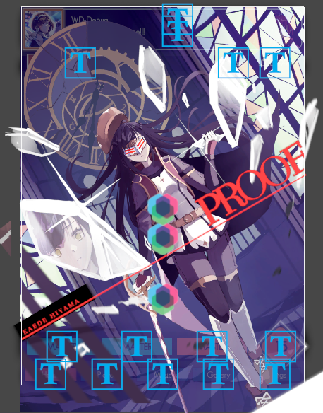
Notice the white rectangle – that is what is displayed on your screen. It is of course different depending on your device, but our reference aspect ratio is 3:4 (iPad). As you can see the portrait artwork (Proof) is the one where almost everything is visible and especially in the landscape artwork’s case, a lot of details wasn’t visible to the player.
In light of this revelation, I decided to have almost all of the new song artworks made in portrait aspect ratio. The other aspect ratios will still be used, but only if I have some special plans for them.
What a Picture Tells
A picture tells… a thousand words, albeit metaphorically. With these artworks you see a glimpse on how some of the characters are connected to each other but by themselves, they lack coherence.
In regards to the game’s story – the general idea is there, but adjustments were made as we have into account costs for additional story-specific artworks and localizations.
One of the solutions I got was to have most (if not all) of the cutscenes come from the perspective of one of the characters. On a pragmatic basis, when two characters meet to each I just have to commission the artwork for one character, since the other character is the player experiencing the story.
Other Updates
Without realizing it, we are already getting closer to the end of the year! Which means we’ll have to prepare for the first closed beta test I promised you all this time! We’ll try to cram a few more songs to the build (I think 14-15 realistically), but most importantly we’ll have some administrative issues to handle with Apple on the App Store side of things.
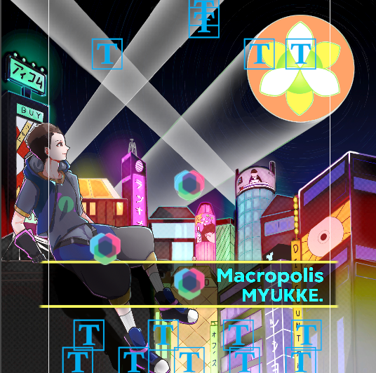
Last week’s poll was won by Macropolis. Look forward to its gameplay video this week! After a few polls, I feel it’s definitely better if we do this if all the options are unrevealed songs. We revealed a LOT of them during our Gamescom Asia trailer so… I don’t know what’s next for the polls.
In the meantime, we have inquired and/or registered to gaming festivals so I suspect you will hear about us a bit more from other sources.
Lastly, we need to have a handler for notched phones. Take a look at the below image which is how the gameplay UI would be on a Google Pixel phone.
It would be so awkward trying to enter the pause screen. Simply adjusting the UI alone will not work, as the notes have to be repositioned accordingly as well. In addition to this, in long phones like these, even less of the song artworks will be visible which is not ideal so we have to handle that too.
So that’s it for today’s blog! In the next part of this series we will talk about the charting.